Some businesses depend on Contact Us form more than others. For such business owners (real estate firms, web service providers, consultants & the like), it’s the main source of lead and profit generation. But this doesn’t mean they have the perfect content form design. In fact, most small businesses out there have deployed sucky content form design, and the same is costing them dearly in 2019 & years lying ahead.
UpReports team has seen many businesses struggle to make ends meet because they put lame Get in Touch, Request a Quote, or Sign Up machines in place. Let’s get straight to the point and gather amazing insights about Contact Form Design.
Below are contact form design disasters along with tips, ideas, and insights to make them rock for your business:
Needy sucks. Thrifty rocks
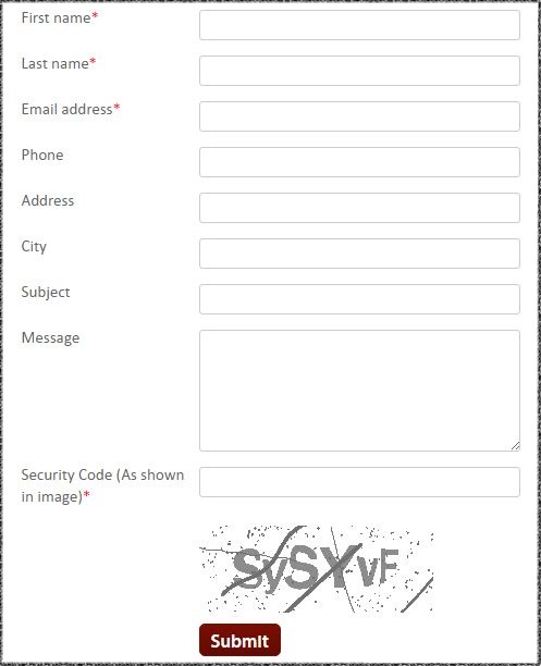
Some conversion forms ask more than what’s required to conduct business. We name such forms as needy conversion forms. These contact form designs drive away visitors by seeking personal information that makes no sense at the initial stage. Some make all the fields ‘required’ and build a disaster for themselves.
Here’s an example for better clarity. The contact form screengrab belongs to a real estate agency and this is all you need to furnish to post a property query with them:

Sucks, doesn’t it? If you have opted for a similar contact form design, it is time to make amends. in 2019, upgrade to a contact form design that demands only what you require to take the discussion ahead. This will make the form submission quicker and easier.
Unending sucks. Brevity rocks.
Some conversion forms require more information, and we totally understand that. But that doesn’t mean you have the right to make the form a mile long! There are ways to gather information without trying the visitor’s patience and making it look like a mile long. The best contact form design practice is to organize the fields in such a way that it appears smaller and don’t require scrolling at all.
Keep your get-in-touch form design short and highly focused. If you are seeking too much info, then, consider splitting your form into multiple steps. It will help a lot with optimization. Ecommerce stores do the same when they have to register new users and process payments at the same time.
Dumb sucks. Intelligent rocks
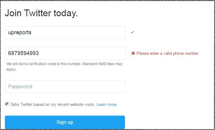
Intelligent forms help visitors through the fields and don’t wait for the visitor to hit the SUBMIT button to highlight errors and suggest changes. In case you haven’t guessed by now, we are speaking about field validation for your contact form design. Validation is something everyone is going for nowadays and you should totally too.
It can work wonders in bringing down the number of form abandonment drastically. Need an example? Here’s Twitter signup form being intelligent and helping users minimize mistakes and make corrections asap.

Field validation is especially crucial for businesses that require a lot of initial information to start the conversation on the right note. So, make validation part of your contact form design!
Confusing sucks. Simple rocks.
In our long careers as UX analysts and site architects, we have fixed many conversion forms that weren’t making sense to website visitors. Forms with the weak two-column arrangement and field labeling were the biggest contributors to the chaos. Language is critical for contact forms catering to local audiences.
A confusing conversion form means visitors have to figure out things and give inputs. And this is not a good sign. Go for a contact form design that caters to the most simple of creatures and quickly gets you to want you to need to make a sale.
|
Optimize contact form for better conversion |
No-thanks sucks. Acknowledgment rocks
A visitor who took the pain to fill out a form just to get in touch with you deserves BIG thanks. If not, at least a notification that the form has been submitted and action will be taken as soon as possible.
If your contact form design is not facilitating that, it will leave visitors guessing if it was submitted at all or not. You don’t want that. Do you? Flash a message-sent message after the visitor hits the Submit button. Want to do something even better? Create a dedicated thank-you page in 2019! It will not only serve the thank-you purpose but also help you in tracking the submissions.
Suggestion – Drop an acknowledgment email to make future clients feel extra special. It doesn’t have to be fancy. Here’s a simple one:

Offline business owners are usually the ones that mess up conversion form design and it’s quite understandable considering their lack of UX and conversion insights. What we are shaking our heads in 2019 are the designers and developers who don’t pay much attention to the most crucial element of the website.
If you think your website form is not performing as per your expectations, then, we are here to help you take appropriate action.
Contact form design – Get feedback
UpReports Team has spent many years doing the same and would love to optimize your conversion form by sharing improvement areas. Our team with do extensive research and undertake surgical changes in your contact form to improve its conversion rate and visitor appeal! Just drop us an email at hello@upreports.com and we will take it from there!
Read what our customers have to say about Upreports, and testimonials from clients, or learn about a content marketing strategy that will multiply your product sales and business leads.
Learn about our most popular digital marketing services:
Social media marketing services in India
Online marketing services in India
Content creation and marketing services in India
